By Cathy Dew
In case you missed it, here are the first five blogs in our series on business process analysis templates:
This week we look at data flow diagrams…
The Devil is in the Details
Continuing our discussion of business process analysis tools and templates, this week we look at data flow diagrams, IPO charts and what I like to call blob diagrams, which are really a high-level data flow diagrams. These tools are incredibly useful in mapping processes for large, complex institutions where centralized systems serve a large customer base. Customers could be internal, such as employees, or external, for example, university students, health center clients, or the public at large. Over the years, we have put these tools to great use in various software project for higher education institutions like University of California Berkeley, Kuali Student and Boston College. The common theme among this set of BPA tools is that the focus is the data rather than the process.
What are Data Flow Diagrams, Blob Diagrams and IPO Charts?
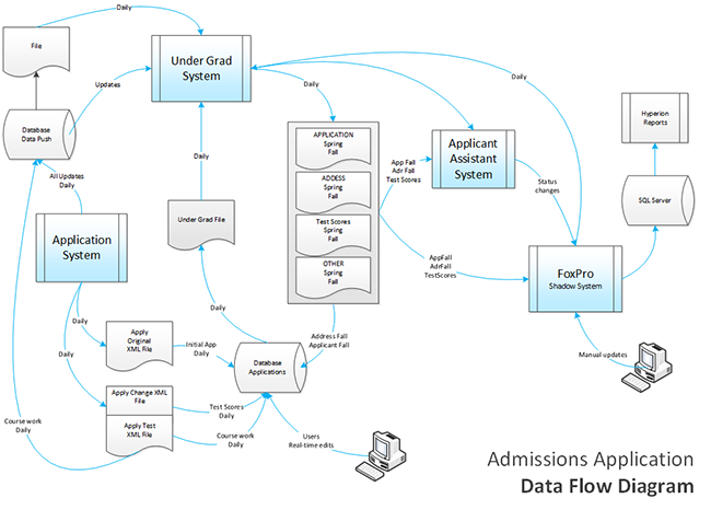
Let’s start with the data flow diagram which is used to visually depict all major components of a large, complex process. Similar to the process flow diagram, there are shapes to represent high-level processes, files and databases; lines are used to connect the components. Arrows show the direction, one-way or two-way, that data flows between them.
A blob diagram (sometimes called a systems diagram) is a basically a data flow diagram at a higher level. You only need one shape, a rounded rectangle (or blob) to represents systems and subsystems (which could be an application or a program); lines with connect the blobs to indicate the general hierarchy of data flow between them.
To make recommendation for improvement, you must understand existing systems and data, as well as how they are interrelated or dependent on one another. Sometimes a system is just pulling information from another system or populating various elements within the system. The source of one-way information transfer is referred to as an "upstream" or "downstream" system, based on the direction of the arrow or way the data flows.
Here is an example of a data flow diagram.
 Click to download a dataflow diagram.
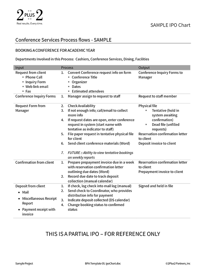
An IPO (Input-Process-Output) chart is a text-based way to look at a process. So instead of a visual view of how systems interact, the IPO is a more detailed document that outlines every step of a process in detail. Its purpose is to capture what data comes in, document what happens to the data (the process), and then what data comes out. Columns and rows have meaning in the IPO chart. Three columns across are devoted to Input, Process and Output, respectively. Each row lists a step in the process and generally the output from a previous step becomes the input for the next step all the way through from beginning to end.
The IPO has a much higher level of detail than blob diagrams and for this reason it is a great companion tool to visual process and data flow diagrams. One of the benefits of these tools is that by documenting all the steps in a process in a very disciplined way you find holes in the process that you need to go back and research to understand.
Together, these assets paint a full picture of a process with all the required systems and resources documented. One important aspect of narrative IPO charts is the importance of using your client's language to describe each step. Resist the temptation to impose any other standard here as it is critical to communicate in words that have meaning to your client.
Here is an example of an IPO chart.

Click to download an IPO chart template for your use.
Why and How to Use Data Flow Diagrams and IPO Charts
The important component these tools help you understand is context. Typically, before completing a business process analysis project, managers only understand a piece of the process, but not the entire end-to-end picture. The power for organizations is in capturing the big picture view while also detailing every step along the way.
So, the strength in data flow (and blob) diagrams is in the context they provide. They also identify data but it is at a very macro level. For detailed data, the IPO chart is your friend. Together, these tools provide a complete picture of a complex system with interdependencies.
Another obvious benefit of data-focused diagrams is that they are visual and offer an easy, high-level view of a data flow across all the related systems. Here’s a practical: make sure your diagrams fit the 8.5" x 11" format and that the text is still readable. This means you have to keep it fairly high-level which was one of the goals of the diagram in the first place.
Challenges and the Art of Navigating the Sea of Data
Some of the challenges using data diagrams and IPO charts center around capturing the optimal amount of detail. These tools are generally consumed by a more technical audience and one pitfall to avoid is getting too bogged down in the details. IT professionals are notorious for wanting perfectly accurate depictions of systems with no generalizations. This can be tricky to navigate. There is an art to managing people and finding the optimal level where you've captured enough information without getting too caught up in the details.
With the IPO chart, it is an issue of granularity. This tool provides you with the opportunity to capture all the detail you want. It's just a balancing act between getting all the steps but not getting bogged down in the minute details.
Another challenge of IPO charts is that they are narrative documents and require reading. This is a common pitfall of any written document – people don’t like to read.
Where do we go from here?
For maximum value, data flow diagrams and IPO charts are excellent tools for any process that involves a lot of different departments to get something done or centralized systems serving a large customer base.
Today, our focus has been on data systems and how they fit into the overall ecosystem in organizations. In upcoming blogs, we will dig deeper into a centerpiece of business process analysis template – requirements.
If you need help navigating this process, feel free to reach out to 2Plus2! We are always happy to help improve your business process analysis tools and templates. Call us on 510-652-7700 or
arrange a consultation.